Paint is the cheapest renovation and the easiest one to regret. A color that looks calm in the store can turn gray in a north-facing bedroom or glow yellow under a warm bulb. The difference is not bad taste. It is light, undertone and the finish you choose. Get those three right and almost any color can work.
Why the Same Color Looks Different in Every Room
Paint reflects the light that reaches it. A north-facing room receives cooler, bluer light, which pushes warm colors toward gray and makes cool colors feel heavier. A south-facing room bathes everything in warmth, so a crisp white can read creamy by afternoon. Artificial light adds another layer: incandescent bulbs warm the wall, while cool LEDs flatten it.
Test in the actual room, on the actual wall, at the actual time of day. Paint two large samples, at least two feet square, on different walls. Live with them for three days and look at them in the morning, at noon and under the room's lamps. A $12 sample pot is cheaper than repainting a living room.
- Sample size: two coats on a two-foot square
- Test period: at least 72 hours, morning and evening
- Ceiling white: same undertone as the wall, not stark white
- Trim: one step brighter or darker than the wall
- Low-VOC paint: better indoor air, similar price
Warm Neutrals Still Lead in 2026
Warm whites, soft greige and clay tones remain the safest whole-house choices. They flatter wood floors, hide minor wall flaws and photograph without turning blue. The mistake is choosing a neutral with the wrong undertone. A green-based greige next to oak can look muddy; a pink-based white next to gray tile can look dirty.
Compare samples against the fixed elements you cannot change: the floor, the countertop and the sofa. If the paint makes the floor look better, it is probably right. If it makes the floor look orange or gray, keep looking. The wall is easy to change; the floor is not.
Green, Blue and Deep Earth Tones
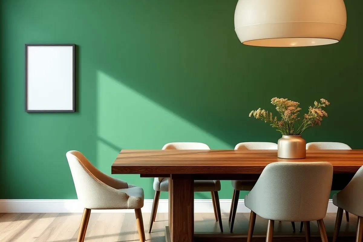
Muted greens continue to replace gray as the default accent. Sage and olive work well in bedrooms and studies because they recede at night. Deep blue-green is a strong choice for a dining room or a built-in bookcase, especially with warm wood and brass hardware. Clay, terracotta and mushroom add warmth without the commitment of red.
Use strong colors where the room ends. A dark color on the far wall of a long room pulls it closer. A dark ceiling in a small powder room makes the ceiling disappear and the room feel taller. In a large open plan, use color to define zones rather than painting every wall the same shade.
Paint the smallest wall the boldest color. You get the drama without living inside it all day.
Sheen Matters More Than Most People Think
Flat paint hides imperfections and looks soft, but it marks easily in busy areas. Eggshell is the practical middle for living rooms and bedrooms. Satin handles moisture and scrubbing, which makes it a better fit for kitchens, bathrooms and trim. Semi-gloss is durable but shows every bump in the drywall.
Use a flat ceiling paint and an eggshell wall paint in most rooms. Keep trim one step brighter than the wall so the edges read cleanly. In a hallway, choose scrubbable paint even if the finish is flat; some modern flat formulas clean far better than the old ones.
Test the Color Against Your Lighting
Buy the same bulb you plan to use and screw it into the room's fixture before you commit. Compare the sample under that light and under daylight. If the room has a dimmer, check the color at low brightness too; some paints shift noticeably when dimmed.
For low-VOC options, the Environmental Protection Agency explains what volatile organic compounds are and why ventilation matters at epa.gov. Ventilate while painting and for a few days after, even with low-odor paint.
Room-by-Room Shortcuts
Living room: a warm white or soft greige, with one accent wall if the room needs direction. Bedroom: a muted green, blue or clay that feels calm at night. Kitchen: a washable eggshell in a light neutral, with color on the island or lower cabinets. Bathroom: satin paint and a color that flatters the tile rather than competing with it.
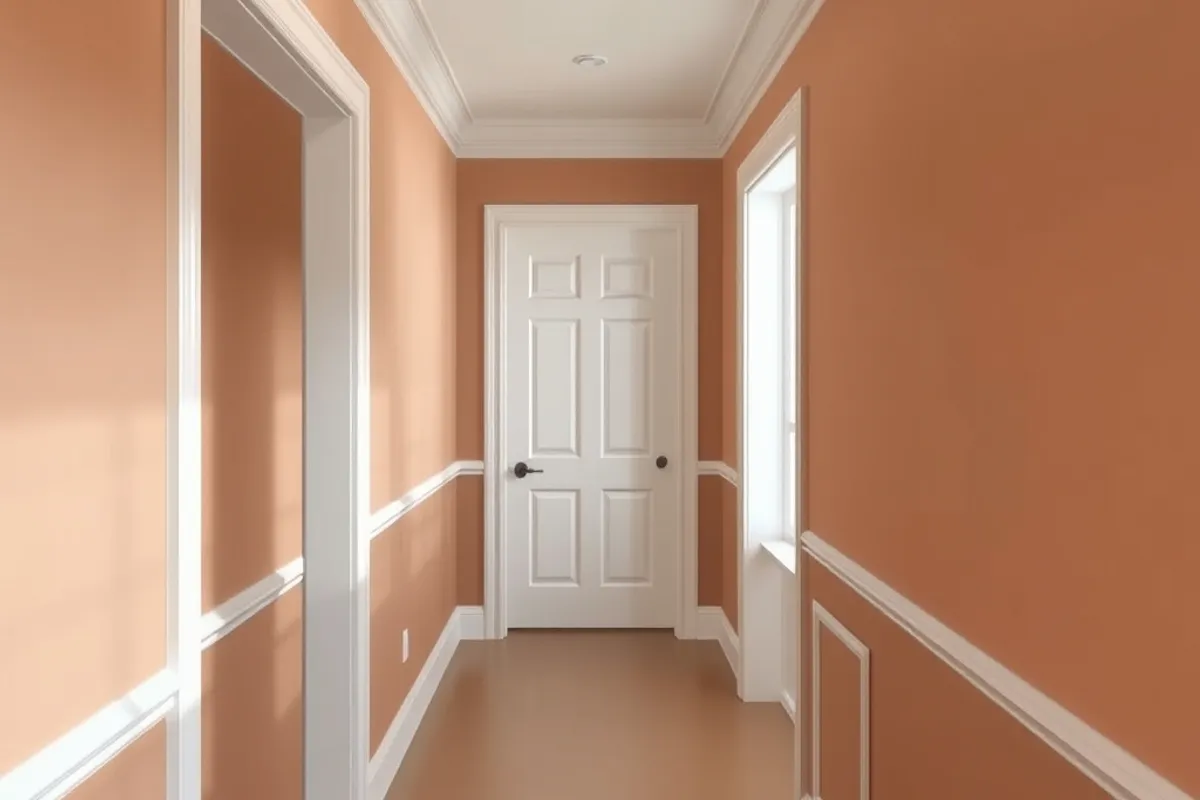
Hallways deserve more credit. They connect every room, so choose a color that bridges the rooms on either side. If the hallway is dark, go lighter than you think; if it is bright, a deeper tone adds depth. For furniture and layout decisions that pair with the new color, see our small living room layout guide. If you plan to hire a painter instead of doing it yourself, our contractor vetting guide covers the license and insurance checks that matter.
Finally, buy one extra gallon and label it with the room and code. Touch-ups are inevitable, and a matched can saves a trip to the store in two years. Good paint is not about following a trend. It is about choosing a color that still feels right when the trend has moved on.